It’s clear that being fat has gotten cheaper along almost every dimension: calories cost less, unhealthy calories cost much less, food preparation costs have plummeted, some of the most costly health effects of being fat have been minimized (due to medications that lower cholesterol, blood pressure, and blood sugar), and being fat has far fewer social costs than in the old days. Any economist will tell you, if you reduce the cost of a good (here, being fat), the demand should go up. Ruh roh.
In my previous post, I dabbled in some data to go at a slightly different angle: what if people are substituting calories for wealth? This hypothesis was spun off of research showing that 1) people primed to feel hungry done less money to charity, and 2) people primed to feel poor eat more when given the chance.
As a reminder, the authors of the study had this to say:
Finally, the symmetric association between food and money may help explain why poor people are especially vulnerable to overeating… as financial and caloric resources are exchangeable, they might tend to appease their desire for money by consuming more calories than is healthy.
I thought we could do more than speculate about this possibility. To do that, I simply looked to see whether the growing income disparity in the U.S. tracked with the growing prevalence of overweight and obesity. (It did.)
But lots of things have happened since the sixties… not all of them bad and not all of them related (my wife, for example). Causality and association are cousins… but they’re definitely not twins and they’re often several times removed.
So to take another shot at testing this hypothesis, I took a look at data across countries rather than data across time. This should help – at least a little – in removing secular trends that can lead to a spurious association. (BTW, if I come back as the lead singer for an indie rock band, remind me to name the band “Spurious Association.”)
This time I snagged the Gini coefficient (a fancier measure of the “inequality of a distribution”) as well as the fraction of the population that’s overweight or obese (i.e., BMI > 25) for a number of countries around the world. I got the international BMI data from the World Health Organization. (“The who?” “Exactly.”) The Gini coefficients come to us courtesy of the CIA World Factbook 2011. The greater the Gini coefficient, the higher the income inequality.
The resulting scatter plot is shown below. Income disparity (Gini coefficient) is shown along the horizontal axis, and the fraction of people who are overweight or obese is shown on the vertical axis. Each country is therefore represented by a single dot, and I plotted a dot for every country for which I had both pieces of data (and for which the Gini data were available from 2000 or later).
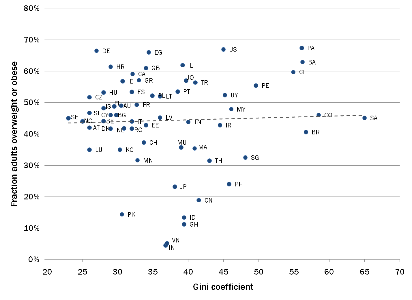
As you can see, there’s not much of an association here… that trend line is pretty darned flat.
But not so fast. Remember that the hypothesis is that people are substituting the accumulation of calories for the accumulation of wealth, and that substituting “down” should only happen (or happen the most often) in environments in which it’s relatively easy to get your hands (okay, teeth) on calories.
Let’s zero in on countries in which even the poor can generally get enough calories to get by; it’s in these countries that we should see those who feel poor getting their needs met via increased caloric intake. Because I have a day job, I took a quick run at this by limiting the analysis to western European countries, Australia, Canada, and the U.S. Here’s the chart focusing on only those countries:
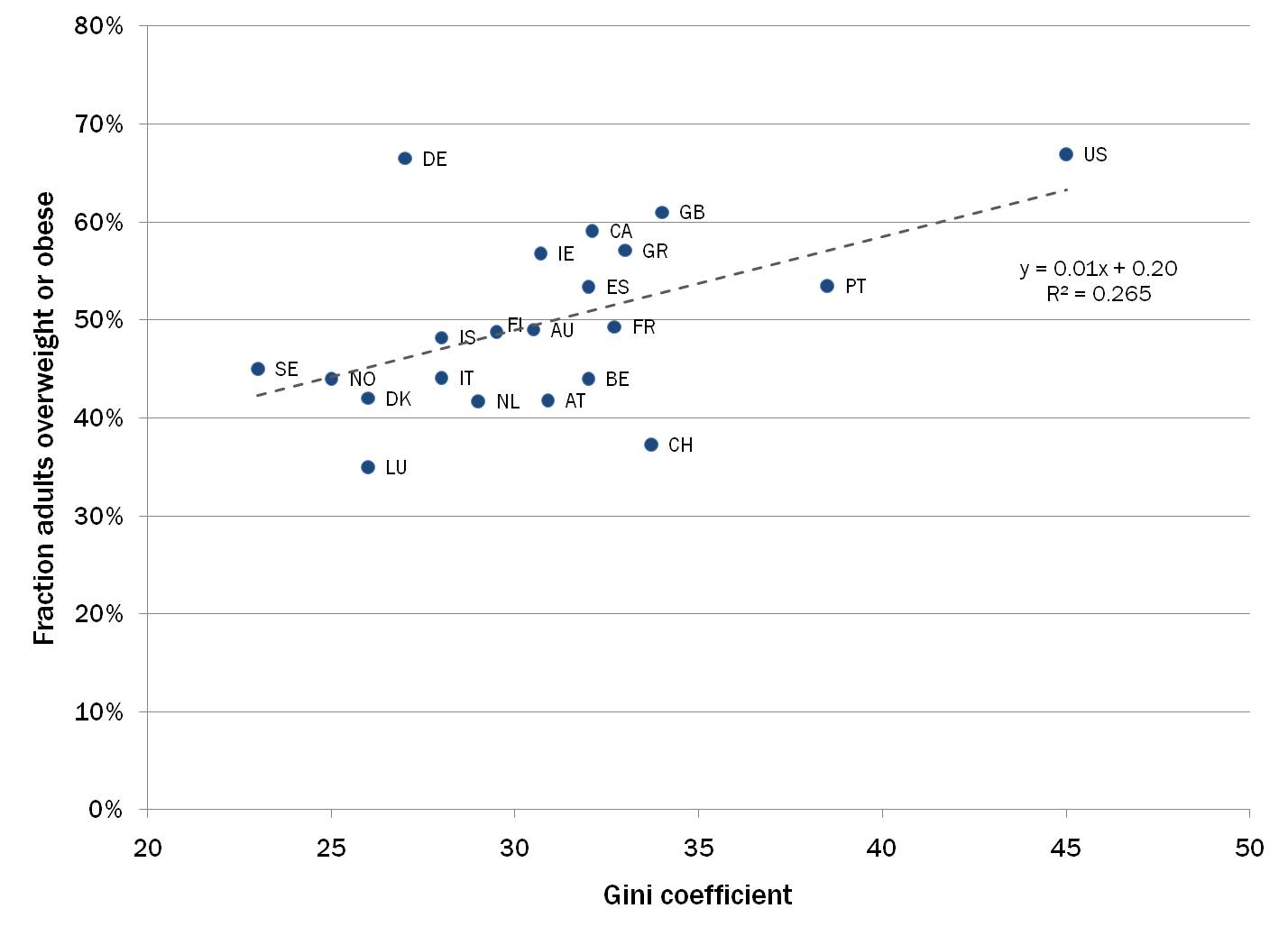
As noted on the chart, the r-squared for the association is a respectable 26.5%, which means that a bit over one quarter of the overall variation in the prevalence of chubbiness between the countries is explained by differences in income disparity. Again, that doesn’t necessarily mean that income disparity is causing people to be fat… it just means that those two things tend to move together across the countries we examined.
Suspend your disbelief for a moment, and some interesting cocktail conversation starters (okay, maybe enders) can be had. First, this association helps us understand whether countries are more or less fat that they “should” be, based on income disparity alone. For example, once we account for our high income disparity, the US is no fatter than to be expected (i.e., falls pretty close to the trend line).
Similarly, the slender Nords (SE, NO, DK, IS), foxy French (FR) and suave Italians (IT) are indeed slimmer… but no more so than would be expected by their more egalitarian economies (i.e., they also fall close to the trend line). The countries that should be applauded are Swizterland (CH) and Luxemborg (LU) — they’re much lighter than we’d guess based on their Gini coefficients. But Germany (DE)… well, maybe it’s time to cut back on the bier und wursts, meine freunde.
The trend line also generates a surprising rule of thumb: among relatively well-to-do countries, an increase in the Gini coefficient of 1 point equates to about a 1% increase in the fraction of the population that’s overweight or obese. Egads.
We don’t really have any way of knowing whether there’s a direct link between changes in income disparity and getting fat. Nor does this analysis tell us much about what we might do to address either issue. But it’s an interesting exercise nonetheless, and it does make me wonder whether we will ever really understand the obesity “epidemic.”